I’m glad so many of you enjoyed my recent post about how I had decorated our apartment. I thought for today’s post I’d go into more detail about my design vision, the unique items I found or had made and how I pulled it all together. You might want to refer to my last post to see where these items fit into the layout of the house.
My Design Vision/Philosophy
One of the most exciting parts about getting a new assignment is the day when the housing team sends photos of your new home. When I got the pictures for Mumbai, I was both a.) shocked by how light-filled and large it was and b.) terrified about how I was going to fill it. There’s nothing I hate more than endless white walls and a house that doesn’t have enough furniture to fill the space. But I also don’t like excess stuff either so … it’s a fine balance people!
Since the amount of stuff we can bring is limited, I decided that I would try to use bright color to help make the space more intimate. Because dark colors make rooms feel smaller. And because we had SO MUCH LIGHT (a great problem to have), the dark colors didn’t look quite so dark. So I decided to go bold. India is all about color – the brighter the better. I decided if I was going to take huge color risks with furniture, rugs and paint, then this was the place to do it.
I was fortunate to have a partial shipment from the States last summer. Because of that, I intentionally purchased some bold statement pieces that would anchor my rooms and tie things together. The first signature piece I stumbled across shaped my initial vision. It was a pair of teal velour chairs that I instantly fell in love with. And the purple velour pillows were sitting nearby, just begging to be paired with chairs. Very fortuitous!
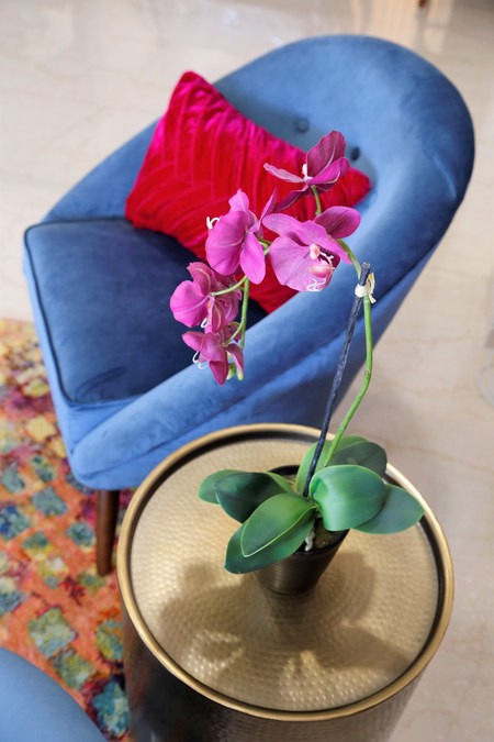
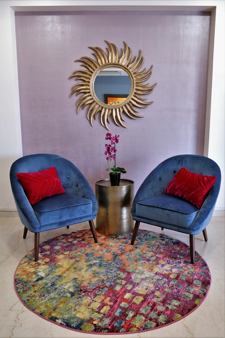
And then in the next aisle over was the great bronze metal drum and it all just worked together like perfection! And thanks to the Target clearance section I was only down $400 for all of that! We had a strange inset in our living room wall, so I decided to do a specialty paint application to make it a focal statement of the room. I hired AsianPaints to do the job and it was very reasonable at $100 for that section of wall. They came one day and layed a dark base coat. Then the second day they applied the metallic purple and raked through it with a metal comb as the paint was drying. So cool!! Didn’t it turn out great with the velour chairs and gold drum??
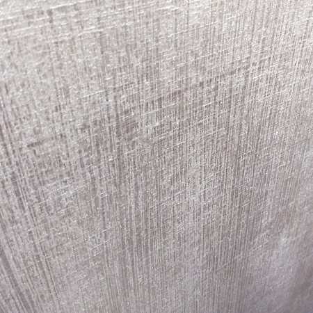
Here’s a close-up of the paint detail.
I knew I wanted some bright color on the floor, so once I had the chairs, I started looking for a bold-colored rug print that I could carry throughout the apartment (and still work color-wise with the chairs). Target came through for me again and I managed to get an 11 x 14, 2 runners and a circle for around $850. If I’m being honest, I was a bit nervous about spending a significant amount of money on such a bold print but it absolutely makes the room and I’m so glad I took the risk.
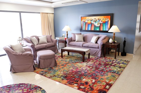
Next up: The Furniture. While I’m grateful to the government for providing us with furniture, I’m not a big fan of the style (I much prefer modern to traditional). If you look back at my initial post, you’ll notice that the couches were a lovely (NOT!) yellow shade. Thankfully, slipcovers exist so I remedied that problem with the help of a great little shop that does tailoring (Salim Furnishing on Hill Road in Bandra). When the slipcovers were put on there was just too much purple so I went to another Furnishings store (Pride Furnishings in Bandra) and had cream & gold pillows and runners made. This was just the trick to break up the purple!
My India Finds
And now, a section on the cool things I found or had made in Mumbai. Technically the slipcovers and table runners should be in this section but they fit better into the narrative above.
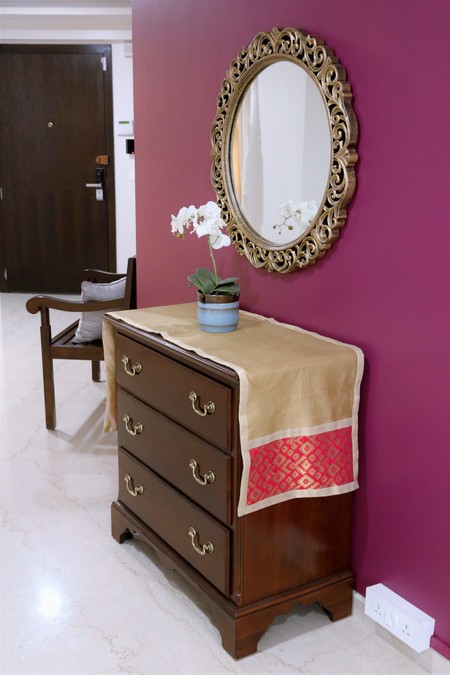
The first thing I’ll show you is this beautiful hand-carved bench from Anjum Wood Carvings in Bandra (right near the Jama Masjid Mosque). They specialize in mirrors but also have all sorts of furniture. They tend to have more traditional styles but I was pleased to find this modern-looking bench. And I loved the price at only $200! Our entryway was looking a little empty and this was a practical piece that would be both functional and aesthetically beautiful.
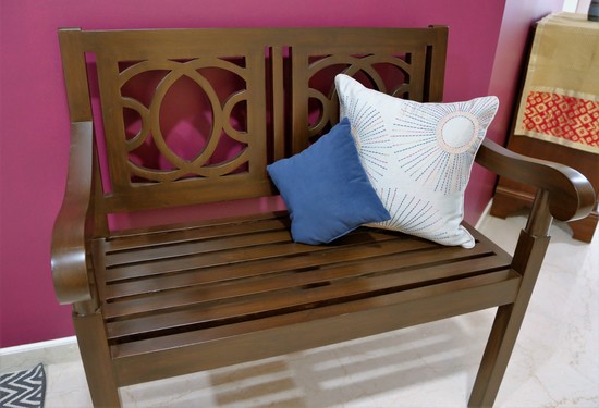
In actuality, I came across the bench when I was out mirror-hunting. I had seen an ornate mirror in another friend’s home and inquired about where she’d gotten it. She pointed me to Anjum Wood Carvings and when I went I found both the bench and the lovely mirror pictured below.
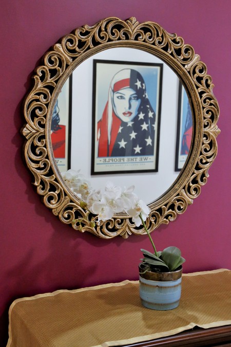
Here’s a close-up so you can see the amazing hand-carved details. As for finishes, I knew I wanted gold to go with the handles on the furniture. Most vendors in the area did a bright shiny gold. I was looking for a more antiqued gold finish and Anjum was able to deliver. I like how the antiqued gold gives it a sense of age, which helped it blend with my traditional furniture.
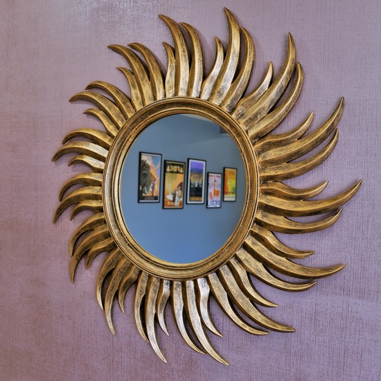
I loved the finish so much that I purchased this sun mirror carving from a different vendor but took it to Anjum for the antiqued gold finish. The finished product turned out really well. The round mirror ended up being $100 and the sun one was about $125. Both are close to 3 feet in diameter.
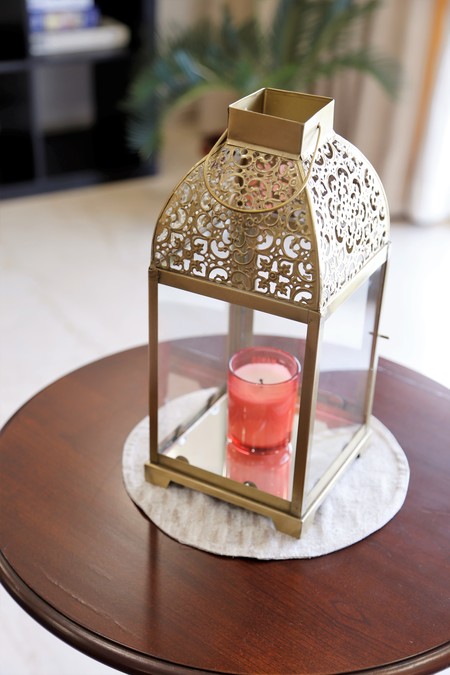
As you can tell, I’m really digging decorating with gold (feels very Indian). So when I stumbled upon this gorgeous lantern at my favorite home decor store Good Earth I knew it was exactly what the living room table needed for a little pop.
Let’s move on to the walls now. All my paint came from AsianPaints. They have great quality paint at around $25-30 for a 5 liter can. My only issue with them was that they didn’t have any paint chips for me to bring home and match with my rugs and furniture. Therefore, I ended up splurging on their paint chip deck. It came in very handy when trying to coordinate all these bright colors.
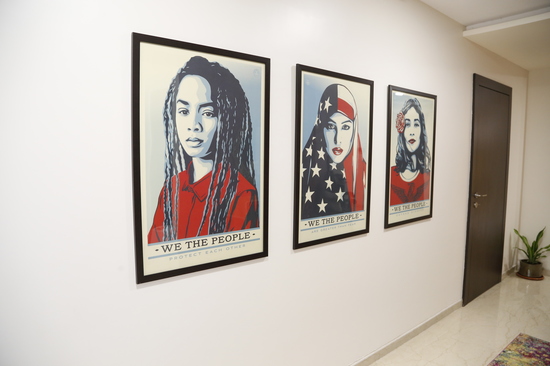
As I eluded to earlier, the walls were very bare (and LARGE) and it was obvious that I didn’t have enough prints to anywhere near cover the walls. I didn’t want to spend a lot of money, so I went with posters and got them inexpensively framed by Frame Bazar in Bandra. I stumbled across these stunning “We the People” posters in my friend Megan’s house and fell in love with them immediately. And at 24 x 36 each, they did a great job of filling one hallway wall. And only $40 for the set of 3 too!
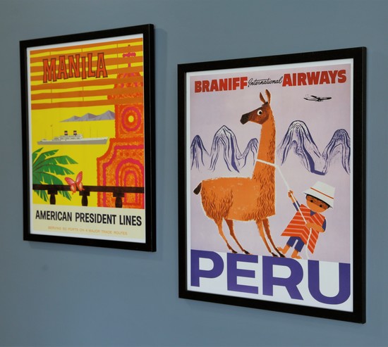
I also wanted to document the places we’d lived in a unique way and came up with the idea of getting a vintage travel poster to represent each place we’ve lived.
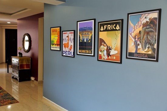
Here you can see the Philippines and Peru.
And here’s DC, Malawi (Africa had to suffice) and India.
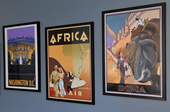
Once again it did a great job of filling a big wall and I love the story it tells. In our back hallway I put an abstract print of Mumbai’s skyline. I also found a kick-ass hot pink velvety elephant that I haven’t found the perfect place for yet. It’s living here for the moment.
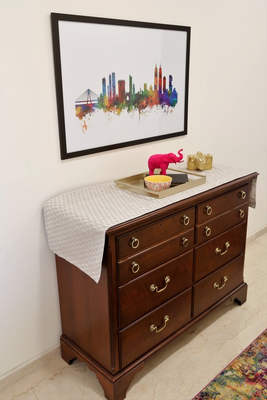
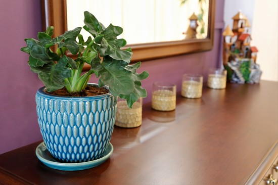
I’ve also started dabbling in plants (we’ll see how that goes) and have been using candles more frequently. Makes it feel very homey.
Whew. That got long. I hope you found it interesting though. As I mentioned in my last post, I’ll have one more decor-related post for you toward the end of the year after my Mom visits and we decorate the guest bedroom, master bedroom and tv room.
Special thanks to my Mom for all the Skype paint consults
she did with me. Couldn’t have pulled it all together without her!
